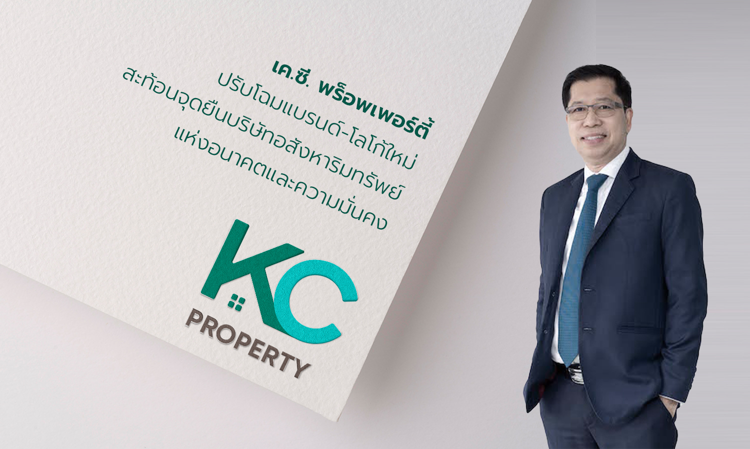
K.C. Property Unveils New Brand and Logo Reflecting Its Position as a Future-Oriented and Stable Real Estate Company
K.C. Property Public Company Limited kicks off 2022 with a rebranding initiative aimed at becoming a future-oriented real estate company that emphasizes stability, modernity, enhances the quality of life for residents, and is environmentally friendly. This move aims to expand its customer base after nearly three decades of success in the quality-focused, value-driven low-rise residential market.
Mr. Santi Piyatat, Managing Director of K.C. Property Public Company Limited, stated, "This rebranding of K.C. Property marks a significant step in declaring our commitment to continuous development, aligning with the rapidly changing market and consumer behaviors influenced by new digital technologies. The updated positioning will enhance the brand's image.
K.C. Property will now embody a more modern, dynamic, stable, and trustworthy personality, representing a contemporary yet tangible real estate brand that can easily reach new target demographics, particularly the younger generation. It will be more creative, flexible, and in tune with the evolving lifestyles of consumers, while still retaining its core strength: 'Quality homes made easy.'
Additionally, the rebranding reflects the new era of K.C. Property following a structural overhaul and the appointment of a new board of directors with diverse expertise to ensure more effective and transparent organizational governance. This includes knowledge of utilizing modern media and digital platforms for marketing, enabling direct, swift, and efficient access to new customer segments.
One of the key aspects of the rebranding is the modernization of K.C. Property's logo. This is evident in the choice of a new, modern font that is bold and rounded, conveying a sense of solidity and stability, complemented by graphics representing windows and gabled roofs harmoniously integrated into the logo. This reflects the brand's identity focused on the development of low-rise residential properties. The cool green tone in the word K.C. symbolizes beginnings, growth, nature, and prosperity, while the brown-gray tone in the word PROPERTY signifies solidity, prudence, stability, and wealth.
Over the past 39 years, K.C. Property has been committed to developing quality homes that are valuable and attentive to detail, ensuring comfort and safety for residents, and focusing on every detail to create satisfaction for customers at all levels.
The infusion of modernity will attract more young people, helping K.C. Property expand its customer base and meet the needs of target groups who value privacy and enjoy a simple, comfortable lifestyle.
“Moreover, the new logo can be conveniently used across digital platforms, aligning with the company's marketing strategy that emphasizes the use of new technologies and communication through digital channels that directly reach target audiences. This enhances communication efficiency, making it easier for customers to remember the brand and make home-buying decisions,” Mr. Santi added.