CP LAND Unveils Major Transformation with Brand Refresh Under the Concept 'Accessible Communities for Life'
CP Land Public Company Limited or CP LAND , one of Thailand's leading real estate developers, has announced a significant brand refresh after a decade, moving towards a modern and global image to enhance organizational awareness and reach new target audiences.

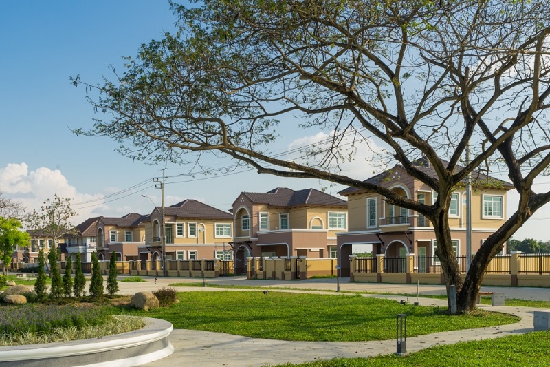
Mr. Kirati Satasuk, Chief Strategy Officer of CP Land Public Company Limited revealed that this brand refresh, occurring after ten years, aims to create awareness and a modern global image, expand the customer base, and reach new target audiences. This is part of a strategy to propel business growth further and faster, under the concept 'Accessible Communities for Life' or 'Quality for Every Life', reflecting CP LAND's commitment to providing convenience that meets the lifestyle needs of customers and communities. It also emphasizes three benefits towards sustainability for the nation, the people, and the organization.
“CP LAND is committed to sustainable development for the organization, firmly believing that the customer is at the center (Customer Centric), placing customer needs as the priority. We also apply a market competition principle that does not solely focus on profits, known as the White Ocean Strategy. This principle means that every business must build a customer base. Our management under this new organizational concept does not only focus on real estate development; CP LAND also supports community development and ecosystem enhancement to meet the lifestyle needs of customers by focusing on developing suitable housing, offices, job locations, or commercial areas that integrate with the community,” Mr. Kirati stated.

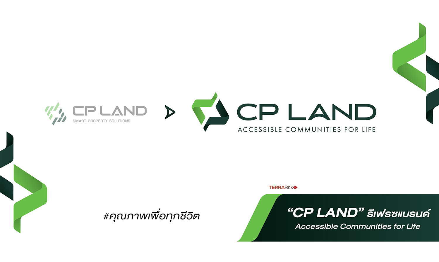
Ms. Sasinan Allmand, Strategic Marketing and Corporate Communications Director of CP Land Public Company Limited stated that the refresh of the CP LAND logo focuses on designing the letters C and P to have continuity and depth, symbolizing the connection between communities and society for inclusive development. A special identity is added with the letter A as an upward arrow to communicate CP LAND's intention as a mechanism to promote area and real estate development for a lifestyle and quality of life that is equitable. The use of green color reflects the organization's philosophy of creating sustainability that fosters care for the community, aiming for balance and growth. The CP LAND letters are designed in a contemporary font, all in uppercase, representing stability while remaining friendly and accessible.
.jpg)
“CP LAND believes that this brand refresh will significantly transform the organization in a clearer direction, better addressing target groups. We firmly affirm that we are ready to drive and elevate the standards of product and service quality, anticipating that our projects will fulfill and meet the lifestyle needs of customers and communities,” Ms. Sasinan concluded.