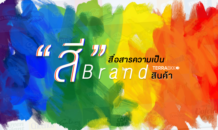
"Color" Communicates Brand Identity
"Color" Communicates Brand Identity
Have you ever noticed in your daily life why famous fast-food restaurants often use red and yellow as their primary colors in their logos? The appropriate use of color is crucial in creating a positive image among consumers. The story of color plays a significant role in customer recall and can evoke feelings when creating promotional materials or advertisements. Therefore, choosing the right color for your brand is essential, as these colors will be present in all communications with customers and promotional activities, whether it's in logos, product packaging, etc. Additionally, "color" can also reflect the cultural differences of products within the same industry.
TerraBKK shares valuable information about 9 important colors, such as blue, red, green, yellow, purple, orange, pink, brown, and black. How can these colors communicate? And has your brand chosen the appropriate colors yet? Here are the details:
Blue
Dark blue reflects trustworthiness, financial responsibility, and safety. It is closely associated with the feelings of the sky and the sea. Therefore, blue and navy are popular colors for products that require credibility, such as real estate and technology.

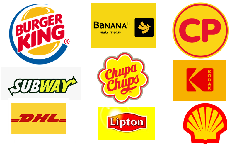
Red
Red stimulates the hypothalamus, increases heart rate, and speeds up breathing. This internal organ response gives red an aggressive, energetic, and attention-grabbing power. Products that commonly use this color group include food items. Additionally, red also signifies danger and warning.

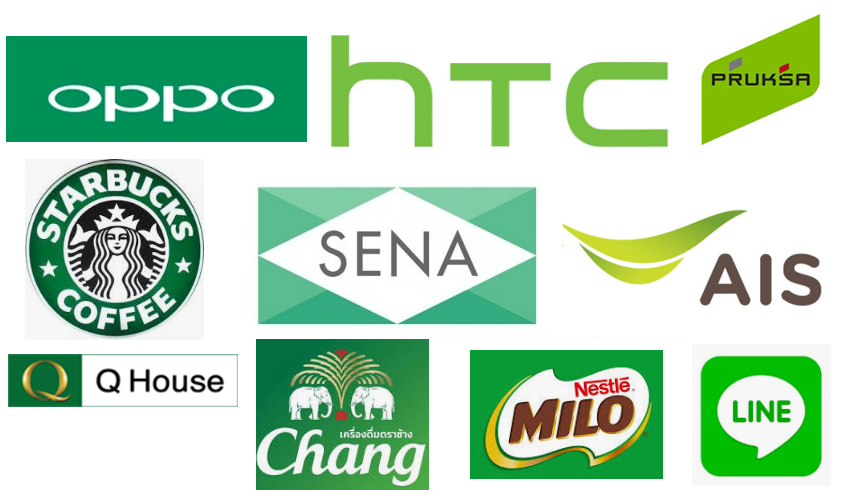
Green
Generally, green represents health, freshness, and tranquility. The meaning of green can vary depending on its shades. Dark green reflects wealth or prestige, while light green conveys calmness and friendliness.
Yellow
Yellow evokes feelings of sunlight or the sun, thus conveying a positive message of warmth. Some shades in this group can also stimulate creativity and energy. It is believed that seeing bright yellow before other colors can influence purchasing decisions.
Purple
Purple is often associated with creativity, combining the calmness of blue and the energy of red, creating a sense of mystery and complexity. Shades like lavender can stimulate thoughts and feelings.

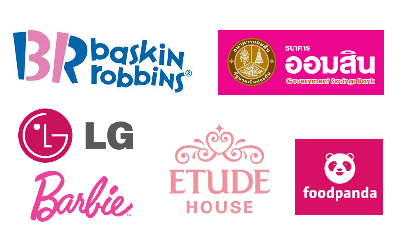
Pink
The feeling of pink varies with its intensity, conveying youthful energy, fun, and excitement. It is particularly appealing for affordable products or trendy items aimed at young women, with light pink evoking romantic feelings.
Orange
Bright orange adds fun and liveliness. When red combines with the bright hue of yellow, orange is created. Research shows that lighter shades attract luxury, and peach tones work well in health care, restaurants, and beauty salons.

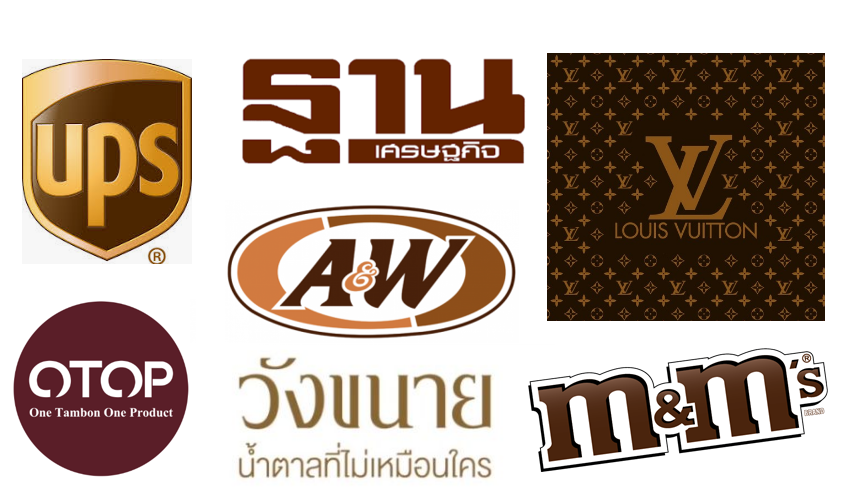
Brown
Brown reflects earthiness, indicating simplicity, durability, and stability. Additionally, certain shades of brown, like terracotta, can convey a luxurious appearance, while some brown tones can also hide dirt.
Black
Black is intense, bold, powerful, and always looks classic. It reflects stories and complexity, making it suitable for high-end products, indicating the solidity of the product.

From the information about "color", we can summarize the overall picture into two basic categories: warm colors and cool colors. Generally, warm tones like red and yellow tend to convey powerful messages, while cool tones like blue reflect calmness and trustworthiness. Additionally, enhancing the brightness of cool tones can also add liveliness. Knowing this, try to apply it in designing your brand.---TerraBKK.com
Article by: TerraBKK Investment Tips
TerraBKK Find Good, Valuable, Affordable Homes